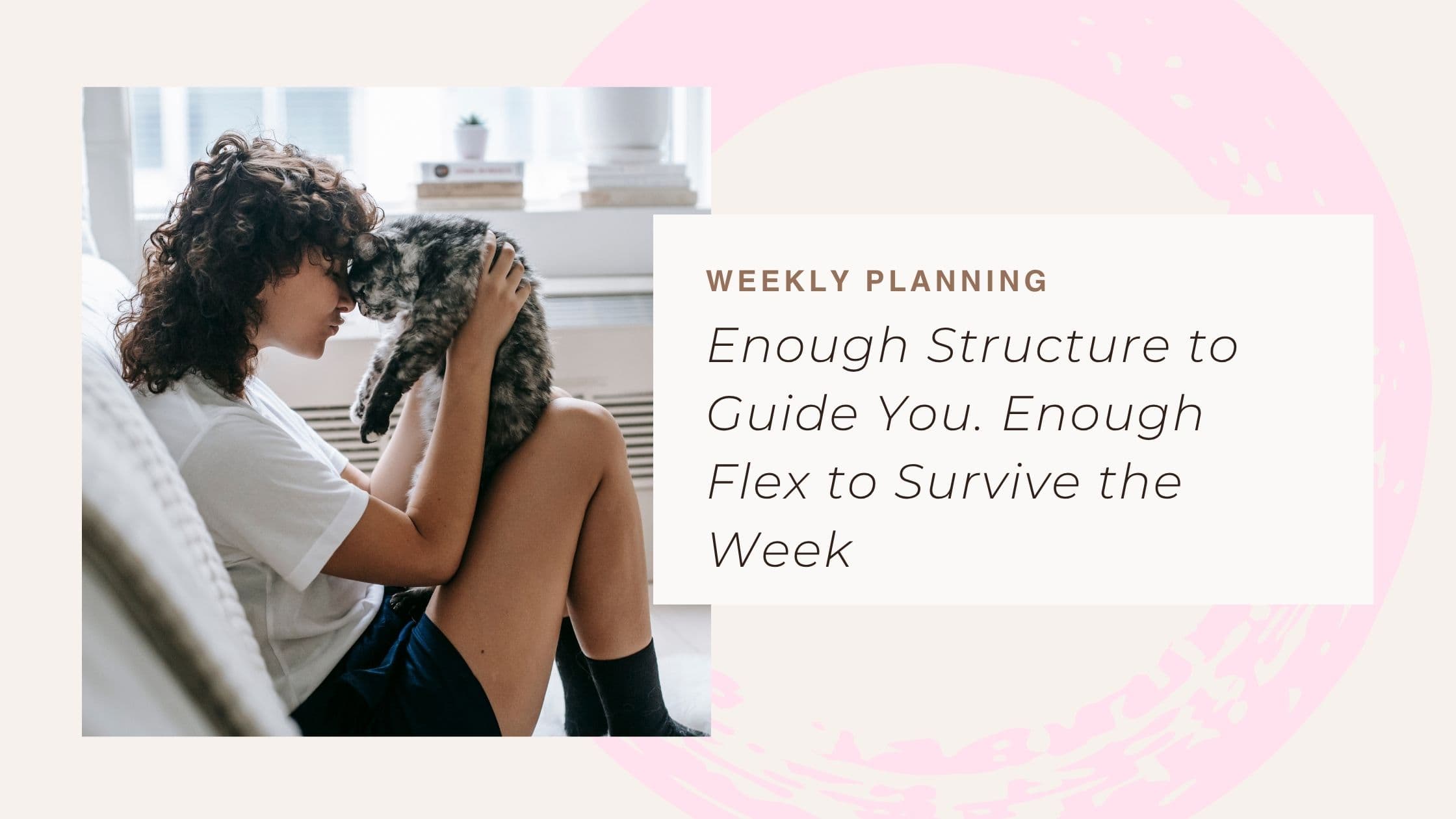
You know the one. Hardback, probably. A cover with enough weight that closing it feels like finishing something. Pages that don't bleed when you press too hard with a pen. You don't toss it in a bag. You slip it in carefully, because some part of you has decided this object matters.
Everyone has a notebook like that. Or had one. Or has been looking for one since the last one ran out of pages.
That feeling, the one you get when you open it and sit a little straighter, isn't about paper. It's about the invitation. Something considered is asking for your attention, and you're more willing to give it.
Two camps, one gap
The planner world split in two at some point, and nobody seems troubled by the divide.
On one side: paper. Beautiful, tactile, finite. Linen-bound journals, leather weeklies, the hand-bound ones from that shop you found on holiday and can never find again online. They make you want to plan. You run your hand across the page and something in your brain settles down and says alright, let's sort this week out.
They can't think, though. They can't sort your deadlines by urgency or tell you which of four Thursday tasks deserves your morning. They sit there, gorgeous and silent, waiting for you to figure it out alone.
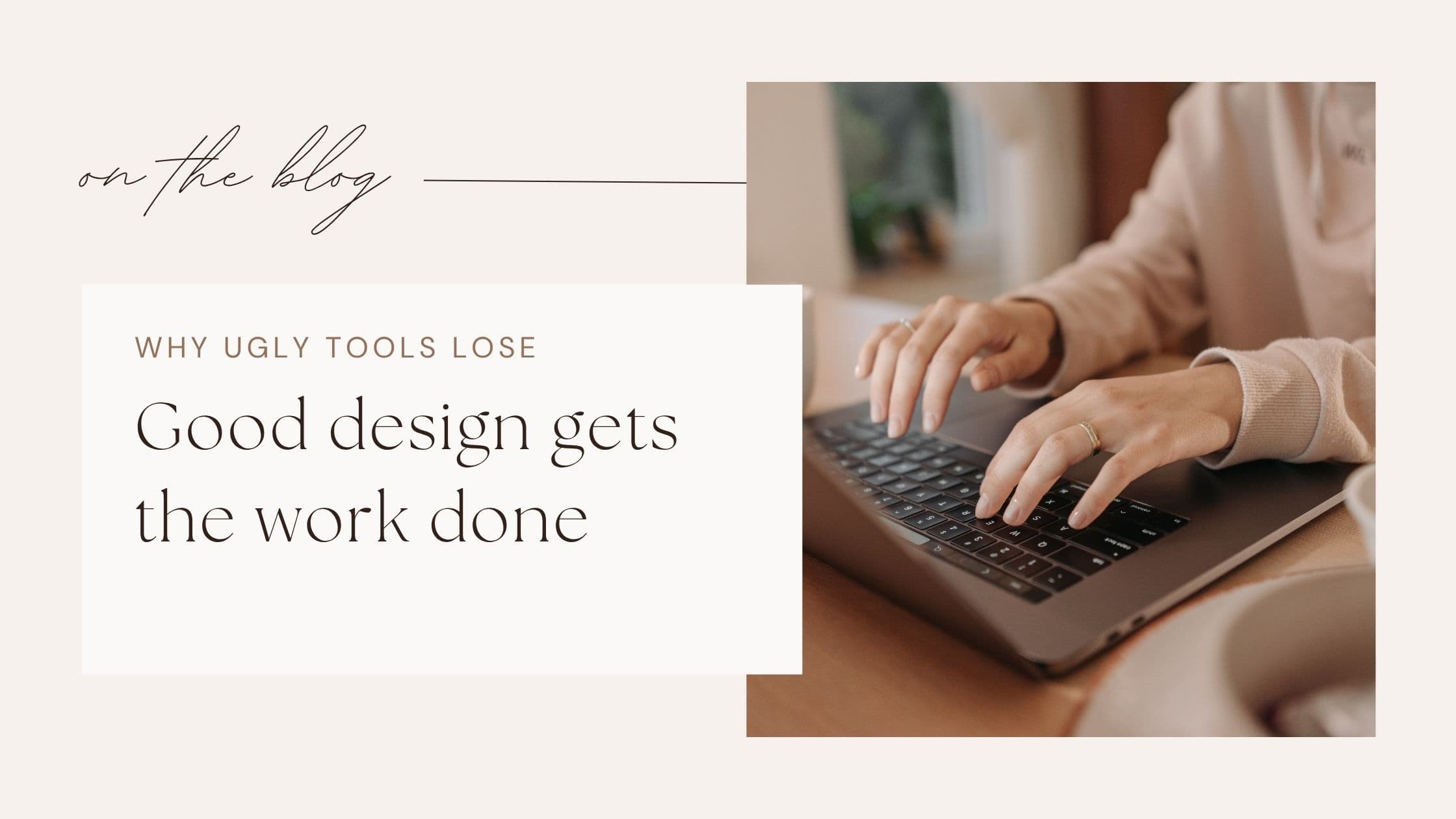
On the other side: apps. Dynamic, powerful, occasionally overwhelming. They can calculate and reschedule and notify. They do clever things with your data. But opening most of them feels like opening your banking app. Functional? Yes. Something you look forward to? Almost never.
Beautiful but passive. Smart but cold. That's been the choice, and it's a false one.
What "feels like a notebook" actually means
Not skeuomorphism. Not fake leather or decorative stitching rendered on a screen. That's costume, and most people can tell.
It means the experience has presence. A cover that closes, like a journal. Typography that someone chose because they cared, not because it was the system default. Colour that means something beyond the hex code a developer copied from a UI kit at midnight.
It means the first thing you see when you open your planner is a page. Your page. Your week, laid out the way a thoughtful friend might lay it out if they had lovely handwriting and twenty minutes to spare. Not a dashboard with widgets. Not a sidebar with seventeen options. A page.
It means feeling ownership before you've done a single productive thing. The way a notebook is yours the moment you pick it up, before you've written a word.
The invisible advantage
The best technology disappears. You don't think about how a good chair works. You just sit in it and your back feels better. You don't study the engineering of a sharp kitchen knife. You just notice that the onion falls into clean slices.
A planner that feels like a notebook should work the same way. You open it and see your week. You don't see the software ranking your priorities or reshuffling your schedule when something changes. That work happens underneath, like plumbing in a well-built house. Quiet, essential, out of sight.
You shouldn't have to think about the technology. You should only have to think about your week.
The home screen test
Here is an honest question. How many productivity apps have you downloaded, used for a week, and then watched slowly migrate from your home screen to a folder called "Stuff" or "Tools" or, in one particularly bleak case I know of, "Should Use"?
The test for a planner isn't whether it works. Most planners work. The test is whether you reach for it. Whether it earns a place beside the four or five apps you genuinely open every day, out of want rather than obligation.
A planner that feels like your favourite notebook passes that test. One that feels like a spreadsheet in a nicer font does not.